

Buses - money where my mouth is
Mrs. D's effort to liven up the new bus designs (below) got me thinking i should probably do more than just kvetch about how ugly they are.
So here's some possibilities.
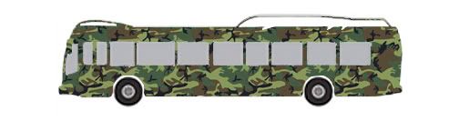
first, in response to Tony in the comments, who wants to see a Camo bus.
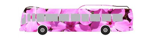
Next, reader NS emails to say that the new designs don't let anybody know that the new buses are more environmentally friendly.
Or this one, which is the beaver lodge behind Compare Foods off Avondale and I-85: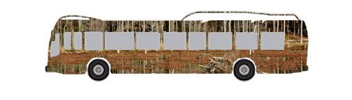
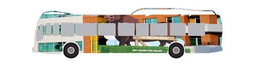
My problem with the proposed designs is that there's absolutely nothing Durham about them. (Some folks might argue that the lack of identity is a Durham quality. I say those folks should STFU.) Here's some Durham-centric options.
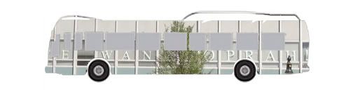
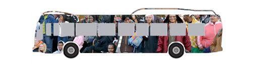
And, finally, a crowd shot at the Durham Holiday Parade, from 2007.
Contemporary printing technology allows for very short run printing to be adhered to buses, making lots of different designs feasible. Surely a city with the world class aspirations of Durham can do better than the generic blandness proposed below. click on any of the photos to see a (slightly) larger version.
Got any ideas of your own? Email 'em to the address on the right sidebar, and i'll post 'em, you betcha.
So here's some possibilities.
first, in response to Tony in the comments, who wants to see a Camo bus.
Next, reader NS emails to say that the new designs don't let anybody know that the new buses are more environmentally friendly.
Or this one, which is the beaver lodge behind Compare Foods off Avondale and I-85:
My problem with the proposed designs is that there's absolutely nothing Durham about them. (Some folks might argue that the lack of identity is a Durham quality. I say those folks should STFU.) Here's some Durham-centric options.
And, finally, a crowd shot at the Durham Holiday Parade, from 2007.
Contemporary printing technology allows for very short run printing to be adhered to buses, making lots of different designs feasible. Surely a city with the world class aspirations of Durham can do better than the generic blandness proposed below. click on any of the photos to see a (slightly) larger version.
Got any ideas of your own? Email 'em to the address on the right sidebar, and i'll post 'em, you betcha.
Labels: Bull Durham, local government, transportation issues
 Since 1949, Durhamites have slept soundly, secure in the knowledge that, in our town, erection can be depended upon. Now, thanks to the power of the internets, we can spread that security all over the world.

2 Comments:
You're right, there is nothing Durham about these designs. A bull or landmark theme would've been nice.
By weege, at 1:12 PM
Love your designs - MUCH better than Durham's! Here's another idea- art from Durham Public School students.
By Kendra, at 2:18 PM
Post a Comment
<< Home